Color Theory in Vegetarian Food Photography Explained
What is Color Theory and Why It Matters
Color theory is the study of how colors interact and affect perceptions. In food photography, particularly vegetarian dishes, color plays a crucial role in capturing attention and evoking emotions. Understanding color relationships can transform an ordinary dish into an enticing visual experience.
Color is the keyboard, the eyes are the harmonies, the soul is the piano with many strings.
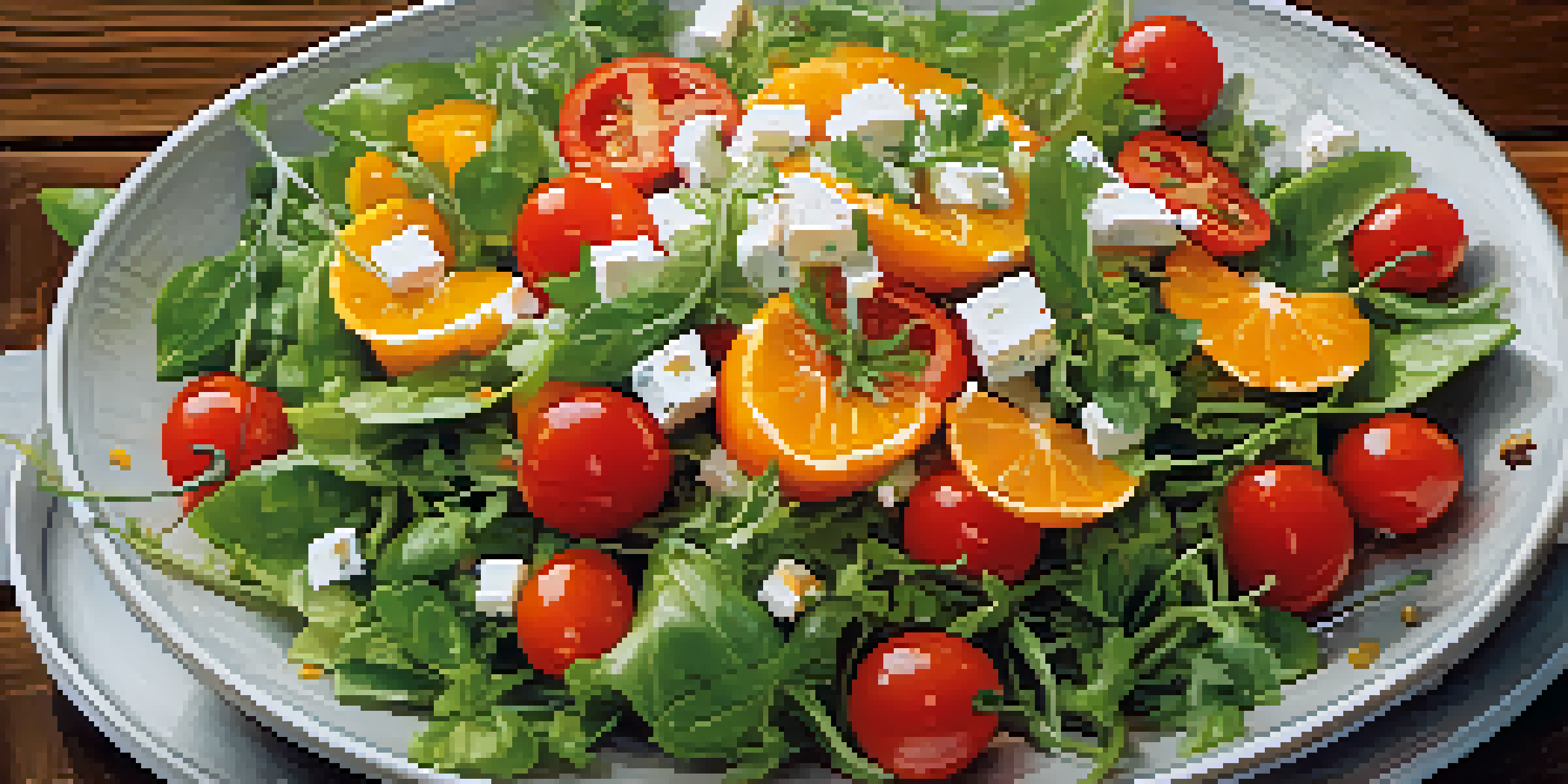
For instance, complementary colors—those opposite each other on the color wheel—create vibrancy and contrast. Imagine a bright green salad with splashes of red tomatoes; this combination not only looks appealing but also stimulates appetite. By using color theory wisely, photographers can create images that invite viewers to savor the dish.
Moreover, color can set the mood for a photograph. Warm tones like reds and oranges evoke feelings of comfort and warmth, while cooler tones like blues and greens can convey freshness and tranquility. This emotional connection can make vegetarian dishes even more appealing to potential customers.
The Role of Color in Food Presentation
In vegetarian food photography, presentation is just as important as the colors themselves. A well-composed plate can enhance the visual narrative. For example, arranging vibrant vegetables in a way that highlights their natural colors can create a stunning centerpiece.
Consider the use of garnishes or sauces to add pops of color. A drizzle of bright green pesto over a plate of pasta not only enhances flavor but also adds visual interest. This careful attention to detail can elevate a photograph from simple to spectacular.
Color Theory Enhances Food Appeal
Understanding color relationships can transform ordinary vegetarian dishes into enticing visual experiences.
Additionally, using contrasting colors can help certain elements stand out. A bright yellow corn on a deep green spinach backdrop creates a striking image, guiding the viewer's eye to the key ingredients. This technique not only makes the dish look more appetizing but also tells a story about the ingredients.
Understanding Warm vs. Cool Colors
Colors can be categorized into warm and cool tones, each invoking different feelings. Warm colors like reds, oranges, and yellows tend to energize and stimulate appetite, making them great choices for comfort food dishes. In vegetarian photography, these colors can highlight hearty meals that evoke warmth and satisfaction.
Colors, like features, follow the changes of the emotions.
On the other hand, cool colors such as blues and greens can create a sense of calm and freshness. These colors work well in photography focused on salads or fresh juices, emphasizing the healthful aspects of vegetarian dishes. By balancing these tones, photographers can craft images that resonate with various audiences.
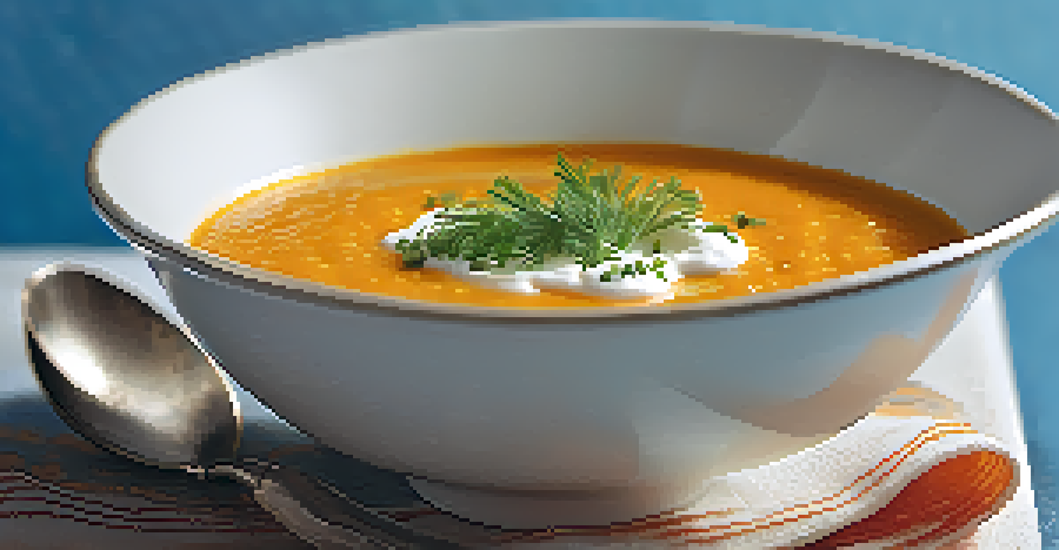
For example, a vibrant carrot soup garnished with a dollop of cream and sprinkled herbs can showcase both warm and cool hues. This not only makes the dish visually appealing but also suggests a well-rounded flavor profile that attracts diverse taste preferences.
Color Combinations for Eye-Catching Photos
Choosing the right color combinations can significantly enhance food photography. One popular method is the 60-30-10 rule, where 60% of the image is a dominant color, 30% is a secondary color, and 10% is an accent color. This creates a balanced and visually appealing composition.
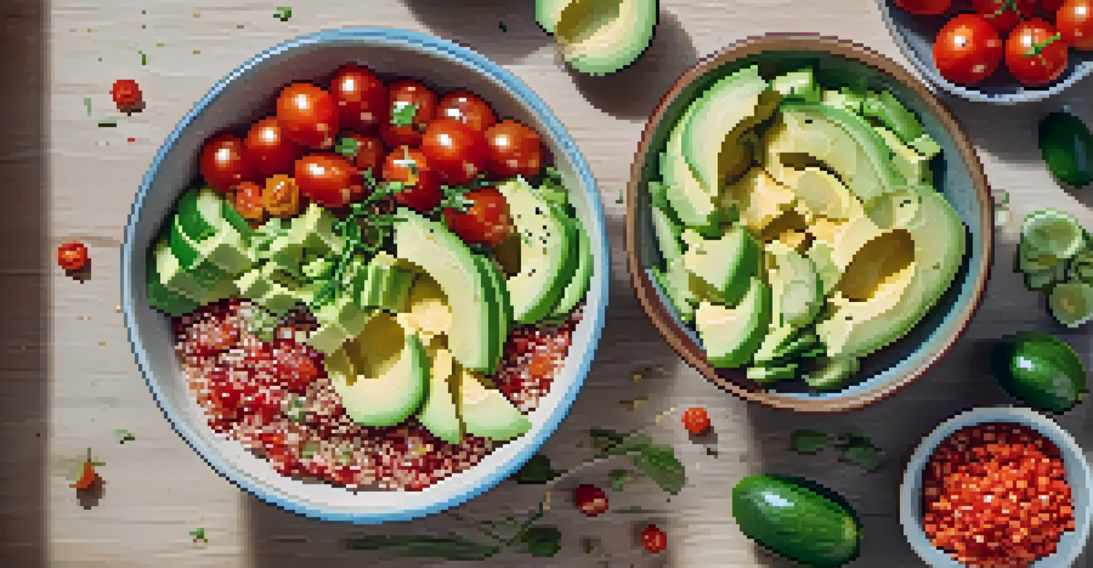
For instance, a bowl of quinoa (neutral base) topped with a colorful mix of cherry tomatoes, bell peppers, and avocado can follow this rule beautifully. The dominant color of the quinoa is complemented by the vibrant vegetables, while a sprinkle of feta cheese serves as an accent that draws the eye.
Lighting Affects Color Perception
Natural light enhances the vibrancy of food colors, making dishes appear more appetizing and inviting.
Experimenting with different combinations can lead to stunning results. A combination of purple cabbage, orange carrots, and green peas can create a lively and inviting photograph, showcasing the abundance and variety of vegetarian foods.
Lighting and Its Impact on Color Perception
Lighting is a crucial element in food photography that can dramatically alter how colors are perceived. Natural light is often preferred, as it brings out the true colors of the food without harsh shadows. Soft, diffused light can enhance the vibrancy of the dish while minimizing unwanted glare.
For example, shooting a colorful vegetable stir-fry near a window during golden hour can create a warm and inviting atmosphere. The sunlight accentuates the bright colors, making the dish appear more appetizing. This natural glow can evoke feelings of freshness and warmth, ideal for vegetarian cuisine.
Conversely, artificial lighting can sometimes wash out colors or create unwanted shadows. Understanding how to manipulate different light sources is essential for any photographer aiming to portray food in its best light, literally and figuratively.
Using Props and Backgrounds to Enhance Colors
Props and backgrounds play a significant role in food photography, especially when it comes to color theory. Choosing the right backdrop can make the colors in a dish pop or even create a cohesive theme. For instance, a rustic wooden table can complement earthy tones in vegetarian dishes, enhancing their natural appeal.
Additionally, using colorful plates or utensils can create contrast or harmonize with the food itself. A bright blue plate can make a vibrant salad stand out, drawing attention to the freshness of the ingredients. This thoughtful approach to styling can transform a simple photograph into a work of art.
Props Enhance Visual Impact
Choosing the right props and backgrounds can make food colors pop and create a cohesive theme in photography.
It's also essential to consider the overall mood you want to convey. A minimalist background can allow the colors of the dish to shine, while a more elaborate setup can tell a broader story about the meal. This balance between food and surroundings is key to creating impactful images.
Final Tips for Mastering Color in Food Photography
Mastering color theory in vegetarian food photography requires practice and experimentation. Start by understanding the basic principles of color interactions and how they affect viewer perception. Keep a color wheel handy as a reference when planning your shots.
Don’t be afraid to play around with different color combinations and lighting setups. Take multiple shots with varying angles and light conditions to see how they change the perception of colors. This experimentation is often where the most creative ideas come to life.
Finally, always consider the story you want to tell through your photography. Whether it's the freshness of a garden salad or the warmth of a comforting veggie stew, using color consciously can enhance that narrative and make your images resonate more deeply with viewers.